
You spend so much time picking colors, fonts, and images to get your designs just right. Thinking “CRAP” through your designing will only help to improve the end result. Before you click to a different site, let me explain.
CRAP is an acronym to remember four key design principles: Contrast, Repetition, Alignment, and Proximity.
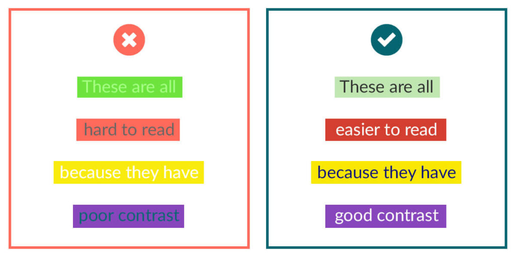
Contrast looks at the variety of colors, fonts, text sizes, and images used. Do these items work together or are they fighting each other for the viewer’s attention? Not only will contrast impact the initial appearance of your work, it will also be important to think about color contrast for those who may be color blind or have difficulties with sight. Below are examples from MyBlogStyle showing color combinations that are difficult to read and some that are easier to read.
When I have a color choice block, I head over to Coolers. Their free program allows you to generate complimentary colors that may offer some inspiration. Even better, they now have a color contrast checker to check your choices before publishing your work.
Repetition allows the user to feel the work is consistent, cohesive, and professional. Something as simple as bolding the headers or using colors in a consistent way throughout, can help guide the reader through your work.
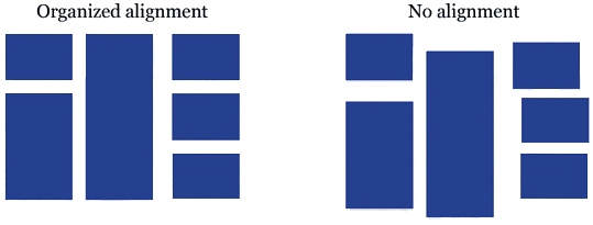
Alignment should be used thoughtfully. Center alignment should be used sparingly and used possibly for titles and text or images your are wanting to highlight. Right and left alignments are your friends and should leave “hard” lines of white space in your work. This will help to make your work look organized. The image below is from SophieTaboneHistory.
When aligning your work, be careful to avoid “orphaned words.” This happens when one or two words are lonely and by themselves at the end of a phrase or paragraph. If you have orphaned words, you will want to adjust the text size or spacing of the text so that the lines of text are fairly the same length.
Proximity calls for related items to be placed together allowing viewers to identify the relationship within the information. For example, if you have an invitation, the time and address of the location should be near each other to help the viewer make an association between the two.
For this writer, contrast is probably the most important of the principles. Although these principles are at their most powerful when used together, contrast is what the viewer makes their snap judgement on. The viewer immediately recognizes the “visual authority” of the work. If the contrast is wrong, the visual authority of the work has been compromised.